25 Ways To Design an Awesome Poster
Design School has put together a great post giving advice to aspiring poster designers on how to make a better poster. We want to share the highlights with you, and if you like them make sure to check the full post on their website.
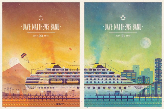
1. Use color to create energy, elicit a mood and attract the eye.
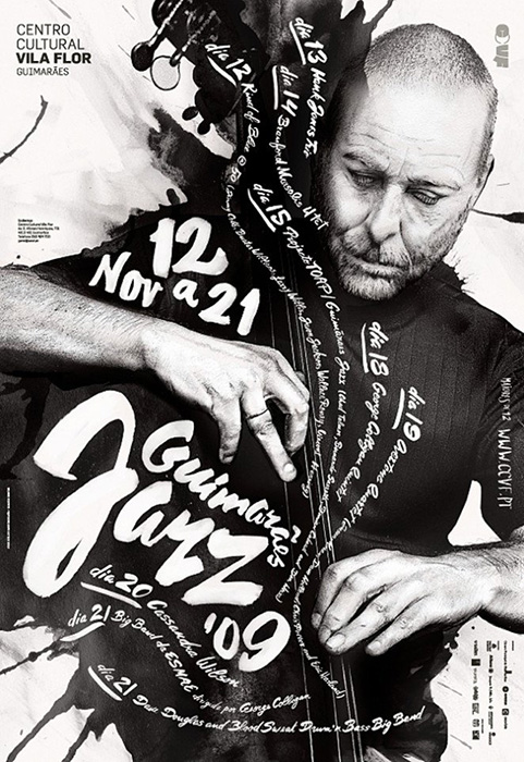
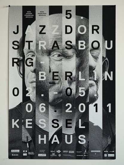
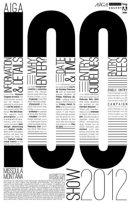
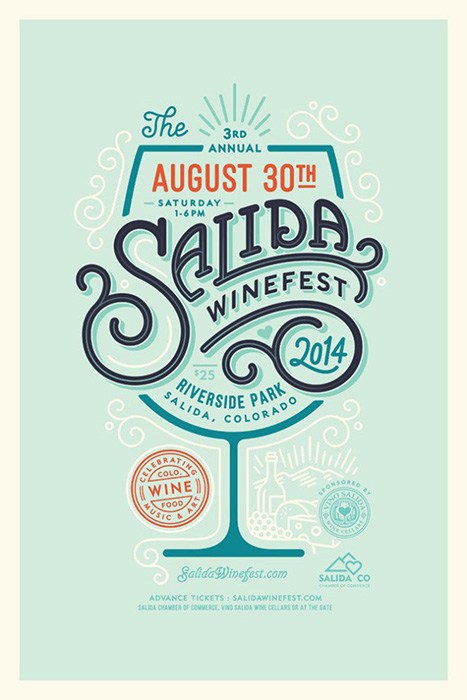
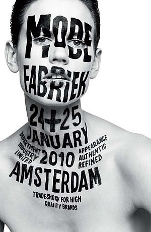
2. Experiment with typography
3. Create visual hierarchy
4. Use negative or white space to form a clever composition
5. Remove unnecessary elements. Say more with less.
6. Create a point of focus
7. Use shapes to create visual interest
8. Be clever with your composition
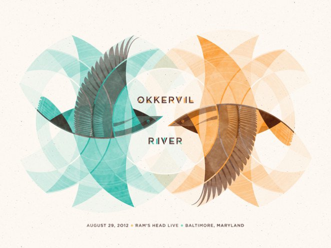
9. Play with layering to create depth and dimension
10. Emphasize elements to create energy and drama.
11. Take the viewer’s focus on a journey with clever perspective
12. Don’t hesitate to use humour
13. Ensure your composition is balanced
14. Use photos to lend credibility to your poster
15. Use creative illustrations
16. Embrace the odd and the unusual
17. Ensure all of your graphic elements flow together
18. Make dense information legible
19. Pay attention to formatting and size
20. Design your poster to evoke emotion. This will make people more likely to share and engage with it.
21. Create consistent templates to use for multiple events
22. Design for your audience
23. Play with contrast for a more interesting composition
24. Experiment with different graphic elements like colors and fonts
25. Once you know the rules, push the limits and break them
Via Design School
