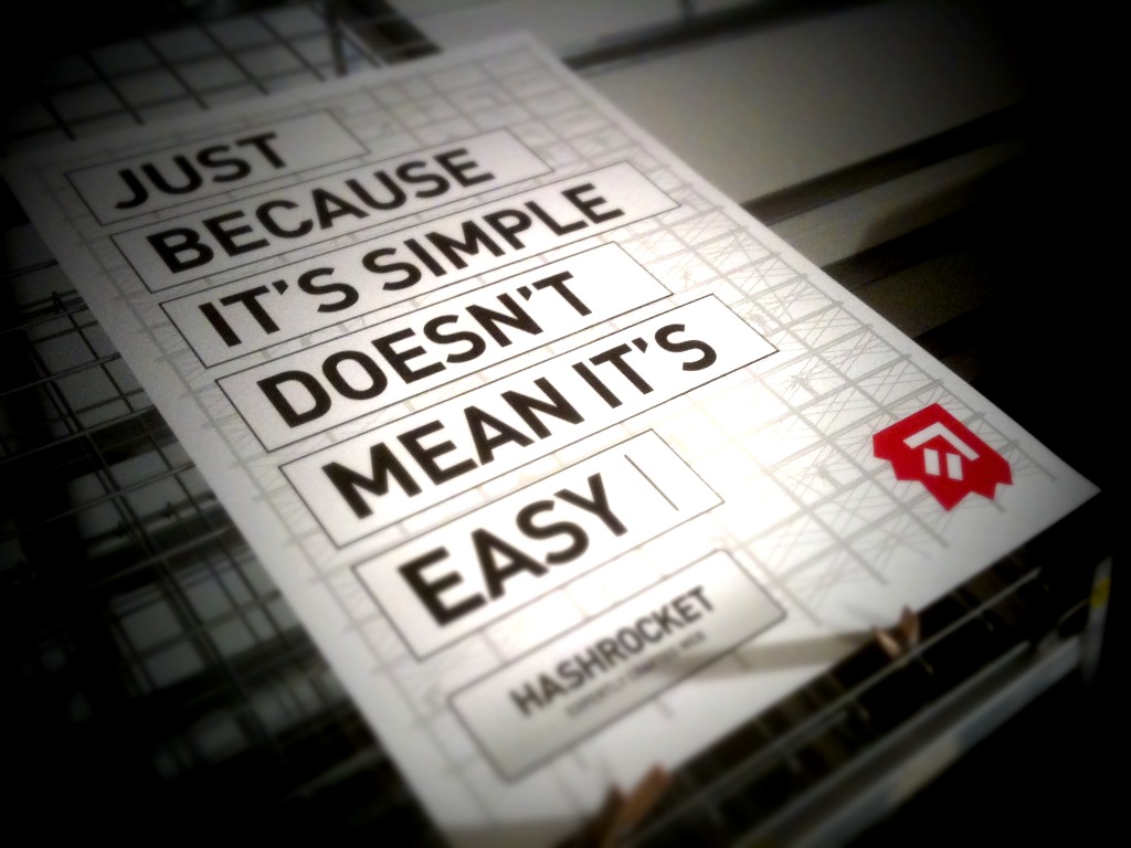
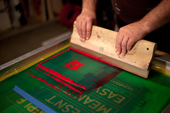
Just Because it´s simple, doesn´t mean it´s easy
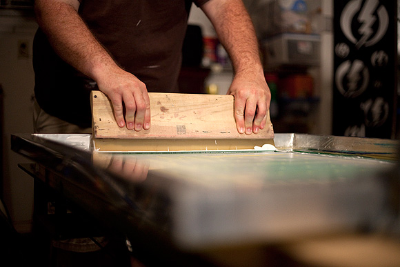
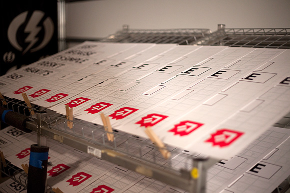
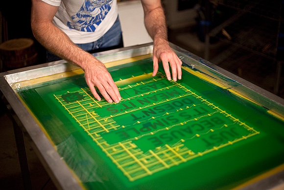
This poster series is an initiative developed during Hashrocket’s rebranding effort. While most people consider branding purely an aesthetic exercise, Hashrocket believes that branding also drives action. They wanted to introduce things into their culture that helped reinforce their company’s values of craftsmanship and quality. Therefore they decided to create something that not only expressed these concepts in the piece, but in the medium itself. Hashrocket hand-screened posters seemed to fit that criteria perfectly.
The concept for this poster was to communicate how hard it is to make something simple. The amount of craft and hard work it takes to make complex ideas and processes into simple interfaces for you to enjoy is often overlooked on the web. They only printed 30 of these posters and they have been giving them out at different conferences and events.
Via Halftonedef
