Poster Monday: La Gioconda
Welcome to this new edition of Poster Monday. For the first spot of the day we are featuring a poster designed by Carlo Fiore, a graphic designer from Italy who mainly designs posters for operas. Inspired by the clarity and poetry of the unforgettable Pierre Mendell and encouraged by the invaluable friendship of Massimo Vignelli he focuses his design work trying to summarize the plot and/or to suggest the expressive tone of music.
Always worked as a musicologist as well as graphic designer, cultivating both disciplines from a very young age; as musicologist his researches were devoted in particular to early music sources, iconography and the relationships between the writing aspects and the music itself (Link); as a designer he started as a book designer and editor, defining an almost unique figure of music-related-designer.
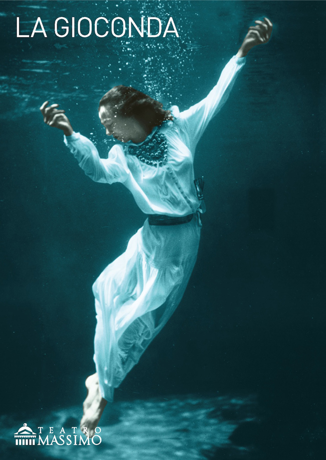
The poster we are featuring here today is one of a great collection of posters designed by Carlo. The poster “La Gioconda” as well as the program note cover series for 2011 opera season of Palermo Teatro Massimo (Gold awarded by Graphis Poster Annual 2013), were designed starting from black and white royalty-free photos that he colored giving them a touch of more drama or a bit of humour, depending on each subject.
“La Gioconda” by Amilcare Ponchielli (1834-1886) was written in 1876: the story revolves around a venetian woman, Gioconda, who so loves her mother that when Laura, her rival in love for the heart of Enzo, saves her mother’s life, Gioconda puts aside her own romantic love to repay her. The villain Barnaba tries to seduce Gioconda, but she prefers death and stabs herself to death in the landscape of a Venice canale. Having this plot Carlo suggested to display a woman committing suicide trowing herself in the green and “dense” water of Venice’s laguna.
As you wait for the next Poster Monday spot of the day, visit Carlo Fiore’s personal site at venticaratteruzzi.com and find out more about his work and style.