9 Clever visual tricks behind iconic posters
How Posters Work, a new exhibition at the Cooper Hewitt, Smithsonian Design Museum, details the techniques designers use to make arresting posters. Wired.com selected their favorite techniques, along with the exceptional posters that illustrate them.
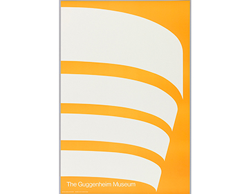
1) Simplify: For this 1969 poster, Malcolm Grear uses bold, abstract lines to represent the unmistakable curves of Frank Lloyd Wright’s Guggenheim Museum.
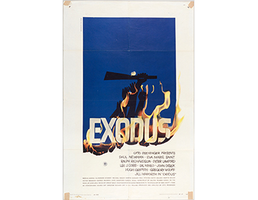
2) Assault the surface: By splattering paint across a photo, or burning a poster—as seen in this Saul Bass print for the 1961 film Exodus—the poster emphasizes its materiality as well as its message.
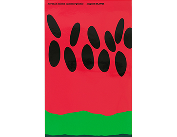
3) Manipulate scale: In a 1970s series for furniture company Herman Miller, Steve Frykholm illustrates giant detail shots of picnic ingredients (corn on the cob, pie, watermelon seeds) to comic effect.
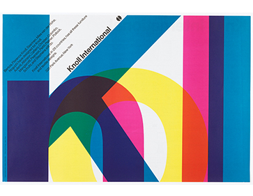
4) Overlap: By overlapping text, designers can play with our perception of depth. Massimo Vignelli does the this in his technicolor ad for Knoll Textiles. The letters sit on top of one another, but the eye can easily make out the company name.
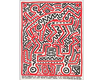
5) Overwhelm the eye: The psychedelic designers of the 1960s flouted the strict rules of modernist type in favor of wavy hand-lettering and vivacious color combinations. A couple of decades later, Keith Haring also opted to overwhelm the eye, but instead of finding inspiration in psychedelia, he drew from New York’s graffiti culture.
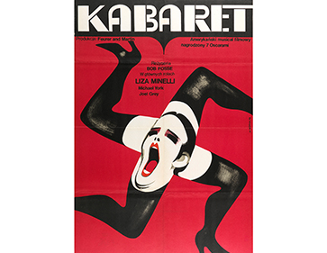
6) Double the meaning: Designer Wiktor Górka created a visual pun for his poster for the 1972 film Cabaret, which takes place in a Berlin nightclub in Nazi-era Germany.
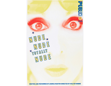
7) Make eye contact: Paula Scher disarms the viewer with her Nude Nude Totally Nude poster, advertising a 1996 play at the Public Theater in New York.
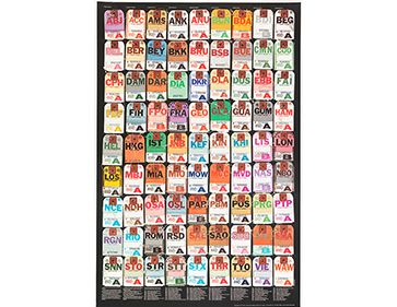
8) Make a system: Organized along a grid, posters can achieve a pleasing feeling of symmetry and balance, as is the case with Ivan Chermayeff’s The Invisible City print for the International Design Conference in Aspen in 1972.
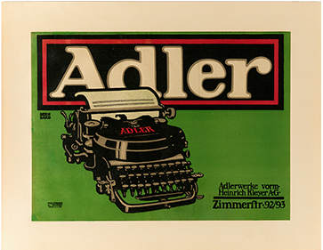
9) Focus the eye: Lucian Bernhard’s print for Adler Typewriters is one of the oldest posters in this survey, illustrating a simple premise: Guide the viewer’s gaze.
What do you think about these useful tips? Can you think of any posters that apply this principles? Share your favorite with us!
via wired