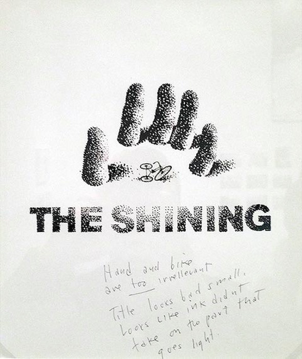
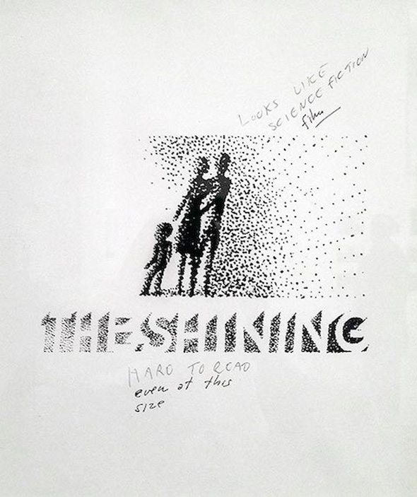
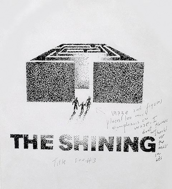
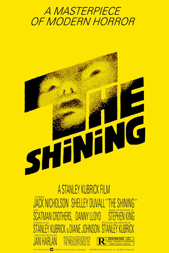
Here are a few unused posters for Stanley Kubrick’s The Shining that were designed by legendary poster artist and title designer Saul Bass. What’s cool about these is that they also include notes from Kubrick on why they didn’t work for the film. It gives us a little insight into how the illustrator worked with the filmmakers to get the right poster design that best represents the movie. The last poster at the end is the one they ended up using.
A great poster with an ever better backstory! Erik Brandt told Typographica the interesting story about a poster he created for an exhibition which was rejected. Brandt chooses to leave the organizers of the exhibition anonymous and explains:
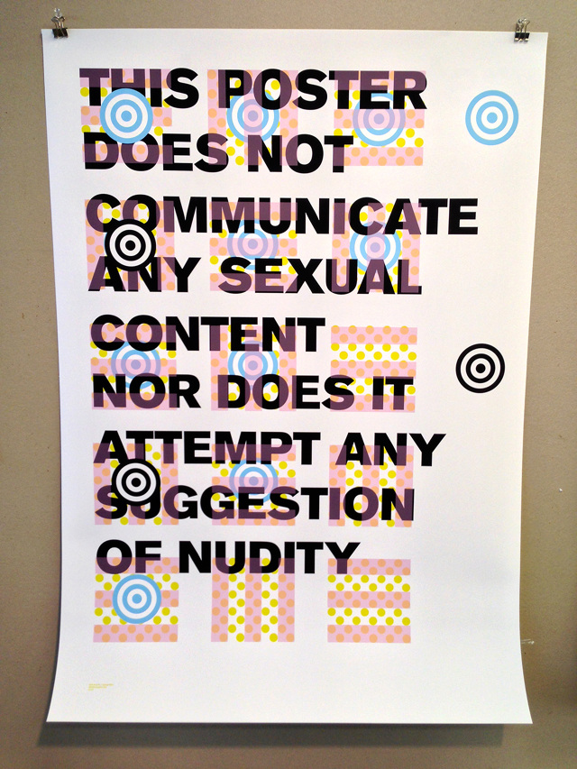
“I was recently invited to exhibit a piece for ‘World Graphic Day’ in an unnamed country. The invitation described a rather short deadline of seven days, but it was the following admonition which provided a tempting opportunity: According to (unnamed country’s) rules, your poster must not have any sexual content or carry any nudity concept (sic). How could I resist?”
He then created the typographic poster featured above, with the ironic text: “This Poster does not communicate any sexual content or attempt any suggestion of nudity”. The poster was rejected for the competition, but the best part was the reason why, which Brandt recalls:
“I find this rejection perfectly fascinating and appropriate given the law of the land. One organizer, very kindly and with apologies, explained that it could not be exhibited because of the word “sexual.” I find it somehow wonderful that this word, which must exist in that language and must be used to prohibit its use (in both the law and the design brief), becomes an issue, despite its clear negation here. That being said, I must admit that this was an intentional provocation on my part, and I consider it a success in that regard.”